On this page
Mobile Input UX
Techniques for making custom-styled inputs work properly on mobile browsers.
I built a terminal-style input for my blog — the kind with a blinking block cursor and monospaced text that looks like a command prompt. On desktop, it worked perfectly. On my phone, tapping the input did nothing. No keyboard appeared, no focus was triggered, and the cursor sat there blinking at nobody.
What followed was a multi-day debugging session across iOS Safari, Android Chrome, and Chrome DevTools (which, as I learned, does not accurately simulate mobile touch behavior). Every fix uncovered a new problem. This post covers every trap I fell into so you can skip the part where you question your career choices.
The Pattern: Hidden Input + Visible Overlay
Custom terminal inputs use a two-layer approach:
- A hidden
<input>with transparent text that receives actual keyboard input - A visible
<div>overlay that renders the styled text with a block cursor
The hidden input captures keystrokes. The overlay renders what the user sees. The overlay has pointer-events: none so clicks pass through to the input underneath.
On desktop, this works flawlessly. On mobile, the relationship between touch events, stacking contexts, and vendor-specific CSS properties creates a minefield.
Problem 1: Touch Events Never Reach the Hidden Input
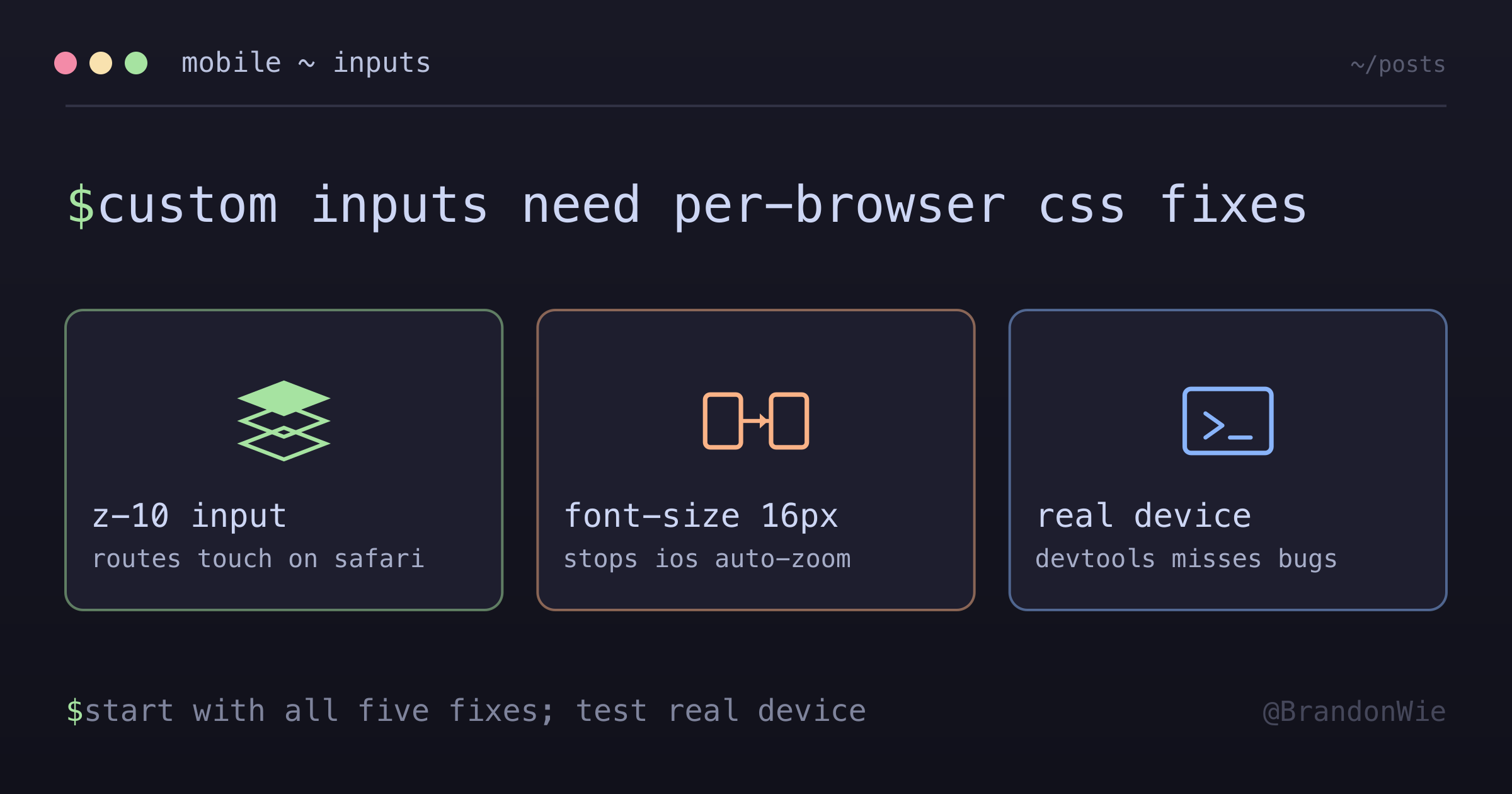
The overlay div had pointer-events: none, which should let touches pass through to the input underneath. On desktop browsers, it does. On mobile Safari, it does not — at least not without an explicit z-index on the input element.
Without z-index, the hidden input exists in the default stacking context. Mobile Safari appears to skip elements in the default stacking layer when routing touch events, even if the element above them has pointer-events: none. This is not documented anywhere obvious — I found it referenced in a WebKit bug tracker entry.
The fix: Add z-10 (or any explicit z-index) to the hidden input. Once the input participates in an explicit stacking context, mobile Safari routes touch events to it correctly.
Problem 2: iOS Safari Auto-Zoom
After fixing the touch events, tapping the input on iOS Safari caused the entire page to zoom in. The keyboard appeared, but the viewport was now at 120% zoom, and the user had to pinch-to-zoom back out.
This was not a viewport meta tag issue. The trigger was the font-size on the input element.
iOS Safari auto-zooms into any input with a font size below 16px. This is a deliberate accessibility feature — Apple assumes small text needs magnification for readability. The ironic part: my input had transparent text. The user could not see the text at all. But Safari does not care about color: transparent — it checks the computed font-size and zooms regardless.
The fix: Set font-size: 16px or larger on the input, even when the text is invisible.
Problem 3: Text Not Fully Hidden on WebKit
Setting color: transparent should hide the text. On most browsers, it does. On some WebKit browsers, the text cursor and selection highlight remain visible, creating a ghostly line in the middle of the “hidden” input.
The fix: Use both color: transparent and -webkit-text-fill-color: transparent. The vendor-prefixed property handles the text cursor and selection rendering that color alone misses.
Problem 4: The Cursor Overlay Was Invisible
This one was the most maddening. The block cursor had correct computed dimensions (10x19px confirmed in DevTools), but it was invisible on screen. The HTML was correct, the CSS was correct, the dimensions were correct — yet nothing appeared.
I debugged this with Playwright MCP by inserting a bright red 50x50 square with z-index: 9999 in the same location. It was visible. Then I removed the z-index from my cursor element. Invisible.
The hidden input had z-10, which created a stacking context that painted a transparent layer on top of the cursor overlay. Even though the input was transparent, its stacking context still occluded the overlay underneath.
The fix: Give the overlay relative z-20 so it paints above the input’s z-10 stacking context, and add pointer-events-none so clicks still pass through to the input.
Problem 5: CSS Height Collapse
The block cursor is a <span> with display: inline-block containing a space character. This is a standard technique for creating a cursor-width element. But inline-block elements with whitespace-only content can collapse to height: 0 in some rendering contexts.
My cursor had correct width (1ch) but zero height. It existed in the DOM, occupied horizontal space, but was a zero-height line.
The fix: Set explicit height: 1.2em and vertical-align: text-bottom on the cursor element.
The Complete Solution
After fixing all five problems, the HTML looks like this:
<div class="relative">
  <!-- Hidden input - must have z-index to receive touch on mobile -->
  <input
    type="text"
    class="absolute inset-0 z-10 h-full w-full bg-transparent caret-transparent"
    style="color: transparent; -webkit-text-fill-color: transparent; font-size: 16px;"
    autocomplete="off"
    autocapitalize="off"
  />
  <!-- Visible overlay - needs z-20 to paint above z-10 input -->
  <div class="pointer-events-none relative z-20">
    {text}<span class="cursor-block">{currentChar}</span>
  </div>
</div>
And the cursor CSS:
.cursor-block {
  display: inline-block;
  min-width: 1ch;
  height: 1.2em;
  vertical-align: text-bottom;
  background-color: var(--accent-orange);
  color: var(--bg-primary);
  animation: blink 1s step-end infinite;
}
Why Each Property Matters
Every CSS property in this solution exists because of a specific mobile browser bug or rendering quirk:
| Property | Purpose |
|---|---|
z-10 | Ensures input is on top for touch events |
relative z-20 | Overlay paints above input’s stacking context |
pointer-events-none | Clicks pass through overlay to hidden input |
h-full | Explicit height to fill container |
height: 1.2em | Prevents inline-block height collapse |
font-size: 16px | Prevents iOS Safari zoom on focus |
-webkit-text-fill-color | Better transparency on WebKit browsers |
Remove any one of these properties and the input breaks on at least one mobile browser. This is the frustrating reality of custom input styling: the solution is a stack of targeted workarounds, and each one addresses a different rendering engine behavior.
When to Use This Pattern
This hidden-input-plus-overlay approach makes sense for:
- Terminal emulators, code editors, or command palettes that need custom cursor styling
- Any UI where a visible
<div>presents styled text while a hidden input captures keystrokes - Projects where iOS Safari compatibility is a hard requirement
When to Avoid It
- Standard form inputs. If you are using normal visible
<input>or<textarea>elements, none of these workarounds are needed. The browser handles touch events natively. - Desktop-only applications. The z-index and font-size fixes are specifically for mobile browser quirks. On desktop, they add unnecessary complexity.
- Accessibility-critical forms. Hiding the real input and showing a visual overlay can confuse screen readers. Prefer native inputs with CSS styling when accessibility is the top priority.
- ContentEditable approach. If you use
contenteditableinstead of a hidden input, the touch event and z-index issues do not apply.
Takeaway
Desktop browser testing does not catch mobile input bugs. Chrome DevTools responsive mode simulates viewport sizes but does not replicate iOS Safari’s touch event routing or auto-zoom behavior. The only reliable test is a real device.
If you are building a custom-styled input that needs to work on mobile, budget extra time for these platform-specific quirks. The five properties in the table above represent five separate debugging sessions. Save yourself the trouble and start with all of them.