On this page
Recharts Dark Theme Customization
Techniques for styling Recharts charts to match a dark terminal theme with CSS
I dropped Recharts into a dark-themed dashboard and every chart rendered with white grid lines, a bright tooltip, and invisible axis labels. The defaults assume a light background. Recharts uses inline styles on SVG elements, not CSS classes, so you cannot fix this with a global stylesheet. Every color must be passed as a prop.
This post covers the specific overrides needed to make Recharts look native in a dark UI — custom tooltips, gradient fills, axis styling, and the gotchas that burned hours of debugging time.
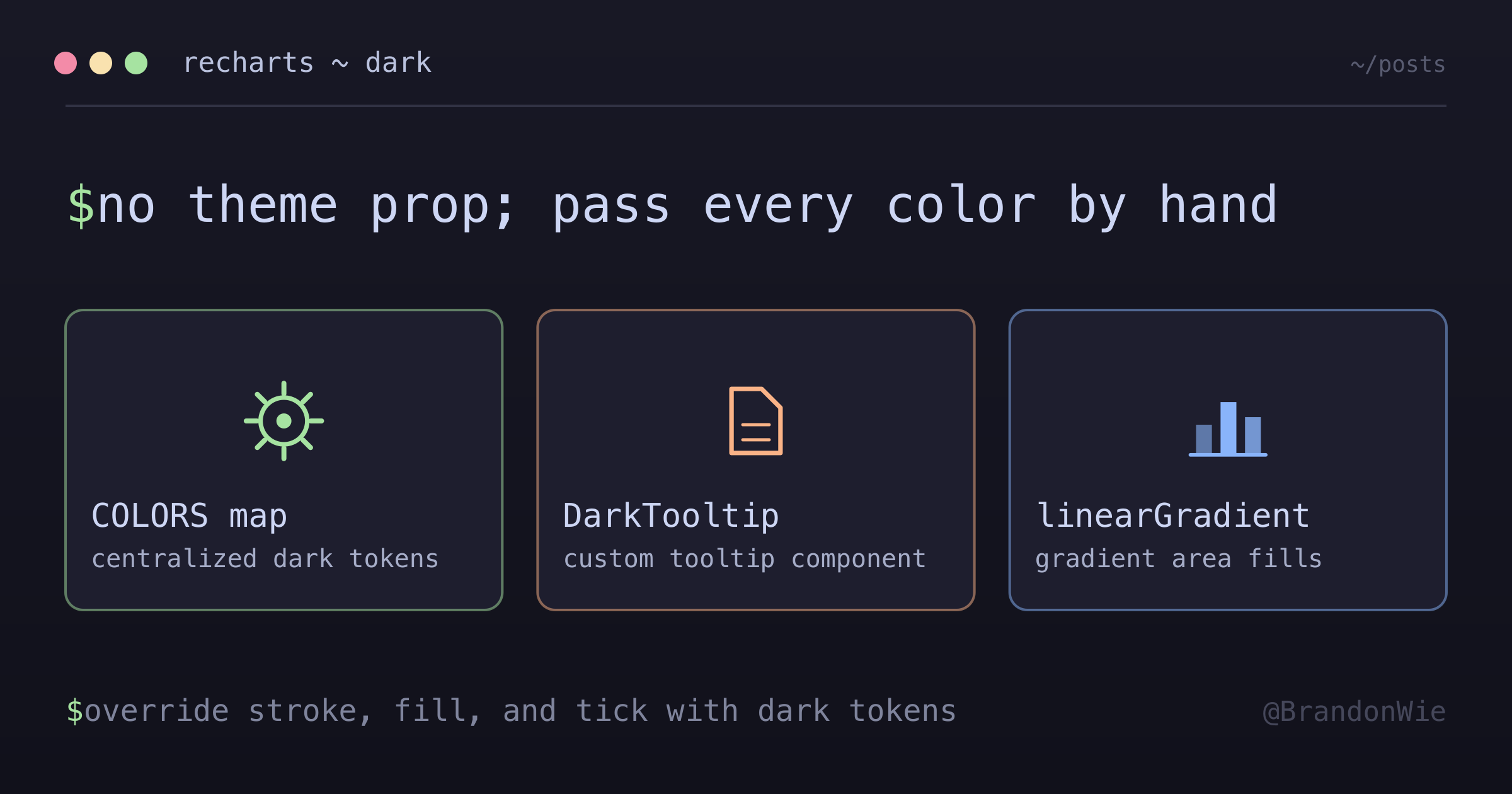
The Core Problem
Recharts renders <svg> elements with hardcoded light-theme defaults. Grid lines are light gray. Tooltip backgrounds are white. Axis tick labels inherit browser defaults that disappear against a dark background. There is no theme="dark" prop. You override each component individually through props.
Four areas need attention:
- Grid lines — default stroke is too bright
- Axis labels — invisible without explicit
fill - Tooltips — white background needs a custom component
- Area fills — flat colors look cheap; SVG gradients fix this
Dark Theme Color Map
Start with a centralized color object. This prevents magic hex strings scattered across components and makes theme changes a single edit.
const COLORS = {
  grid: "#404040", // --border
  axis: "#888888", // --text-muted
  tooltip: {
    bg: "#2d2d2d", // --bg-secondary
    border: "#404040", // --border
    text: "#e5e5e5", // --text-primary
  },
  series: {
    primary: "#6b9eff", // --accent-blue
    secondary: "#da7756", // --accent-orange
    success: "#7ec699", // --accent-green
  },
};
These values come from a terminal-inspired design system (CSS custom properties), but any dark palette works. The key is mapping each Recharts surface to a token.
Custom Tooltip Component
The built-in tooltip accepts contentStyle and labelStyle props, but they are limited. A custom component gives full control over layout, colors, and formatting.
function DarkTooltip({ active, payload, label }) {
  if (!active || !payload?.length) return null;

  return (
    <div
      style={{
        background: "#2d2d2d",
        border: "1px solid #404040",
        borderRadius: "6px",
        padding: "8px 12px",
        fontSize: "12px"
      }}
    >
      <p style={{ color: "#888888", marginBottom: 4 }}>{label}</p>
      {payload.map((entry, i) => (
        <p key={i} style={{ color: entry.color }}>
          {entry.name}: {entry.value}
        </p>
      ))}
    </div>
  );
}
Pass it via <Tooltip content={<DarkTooltip />} />. The payload array carries series colors automatically, so each line matches its chart series without extra mapping.
Area Chart with Gradient Fill
Flat area fills look like colored blocks. An SVG <linearGradient> that fades from 30% opacity at the top to 0% at the bottom creates depth without overwhelming the chart.
The gradient is defined inside <defs> within the chart, then referenced by id in the <Area> component’s fill prop.
<ResponsiveContainer width="100%" height={200}>
  <AreaChart data={data}>
    <defs>
      <linearGradient id="colorLatency" x1="0" y1="0" x2="0" y2="1">
        <stop offset="5%" stopColor="#6b9eff" stopOpacity={0.3} />
        <stop offset="95%" stopColor="#6b9eff" stopOpacity={0} />
      </linearGradient>
    </defs>

    <CartesianGrid
      strokeDasharray="3 3"
      stroke="#404040" // Dark grid lines
      vertical={false}
    />

    <XAxis
      dataKey="time"
      stroke="#888888" // Muted axis color
      tick={{ fill: "#888888", fontSize: 11 }}
      tickLine={false}
      axisLine={false}
    />

    <YAxis
      stroke="#888888"
      tick={{ fill: "#888888", fontSize: 11 }}
      tickLine={false}
      axisLine={false}
    />

    <Tooltip content={<DarkTooltip />} />

    <Area
      type="monotone"
      dataKey="latency"
      stroke="#6b9eff"
      fill="url(#colorLatency)" // Gradient reference
      strokeWidth={2}
    />
  </AreaChart>
</ResponsiveContainer>
The pattern to remember: <linearGradient id="X"> in <defs>, then fill="url(#X)" on the component. If the gradient does not appear, the id strings do not match — this is the most common debugging dead end.
Horizontal Bar Chart (No Axis)
For compact dashboard widgets, you can strip axes entirely and let the bar lengths speak for themselves. A vertical layout with category labels on the left works well in narrow sidebars.
<ResponsiveContainer width="100%" height={160}>
  <BarChart data={data} layout="vertical" barSize={16}>
    <XAxis type="number" hide />
    <YAxis
      type="category"
      dataKey="name"
      width={80}
      tick={{ fill: "#888888", fontSize: 12 }}
      tickLine={false}
      axisLine={false}
    />
    <Bar dataKey="value" radius={[0, 4, 4, 0]}>
      {data.map((entry, i) => (
        <Cell key={i} fill={INTENT_COLORS[entry.name]} />
      ))}
    </Bar>
  </BarChart>
</ResponsiveContainer>
The radius prop rounds the right end of each bar. Setting hide on the XAxis removes it from render while keeping the layout engine working.
Bundle Size Warning
Recharts adds roughly 650KB to the bundle. On a dashboard where charts are one tab among many, lazy loading prevents that cost from hitting the initial page load.
// Lazy import for code splitting
const MetricsWidget = lazy(() => import("./MetricsWidget"));

// Or import only what you need (tree-shaking)
import { AreaChart, Area, XAxis, YAxis } from "recharts";
Named imports enable tree-shaking in bundlers that support it (Vite, webpack 5+). Importing from recharts without destructuring pulls in everything.
Common Gotchas
These are the issues that cost real debugging time. Each one has a quick fix once you know the cause.
| Issue | Solution |
|---|---|
| White grid lines on dark bg | Set stroke="#404040" on CartesianGrid |
| Axis text invisible | Set tick={{ fill: '#888888' }} |
| Tooltip has white bg | Use custom tooltip component |
| Gradient not showing | Ensure id matches fill="url(#id)" |
| Chart overflows container | Always wrap in ResponsiveContainer |
| v3 Tooltip formatter type | Use (value) => not (value: number) => — v3 changed to number \| undefined |
The v3 formatter issue is particularly sneaky. If you type (value: number) => in a formatter prop, TypeScript compiles fine but the runtime receives undefined on certain tick marks. The Recharts v3 type for tooltip values is number | undefined, so the callback signature must match.
Takeaways
Dark-theming Recharts is not difficult — it is tedious. Every surface needs an explicit color prop because the library has no theme system. The approach that scales is a centralized color map (or CSS custom property references), a custom tooltip component, and SVG gradients for area fills.
Once you have these three building blocks, adding new chart types follows the same pattern: override stroke, fill, and tick props with your dark tokens. The gotchas table above will save you from the most common “why is this invisible” moments.