On this page
shadcn/ui Setup with Vite + Tailwind
Manual setup of shadcn/ui component primitives in a Vite + React + TypeScript +
I kept running npx shadcn-ui init every time I started a new Vite project, watching it scaffold a components.json, rearrange my folder structure, and install a dozen packages I did not ask for. Then one day the CLI broke something in my existing Tailwind config and I spent an hour fixing it. That was the last time I used the CLI. Here is how to set up shadcn/ui manually — and why doing it by hand is worth the five extra minutes.
What shadcn/ui Is (and Isn’t)
The first misconception to clear up: shadcn/ui is not a component library you install from npm. There is no @shadcn/ui package. It is a curated collection of copy-paste components built on top of Radix UI primitives. You own every line of code it generates, and the underlying dependency footprint is small and composable.
This distinction matters because it means the “setup” is not about configuring a library — it is about putting four small pieces in place so that copy-pasted components work in your project.
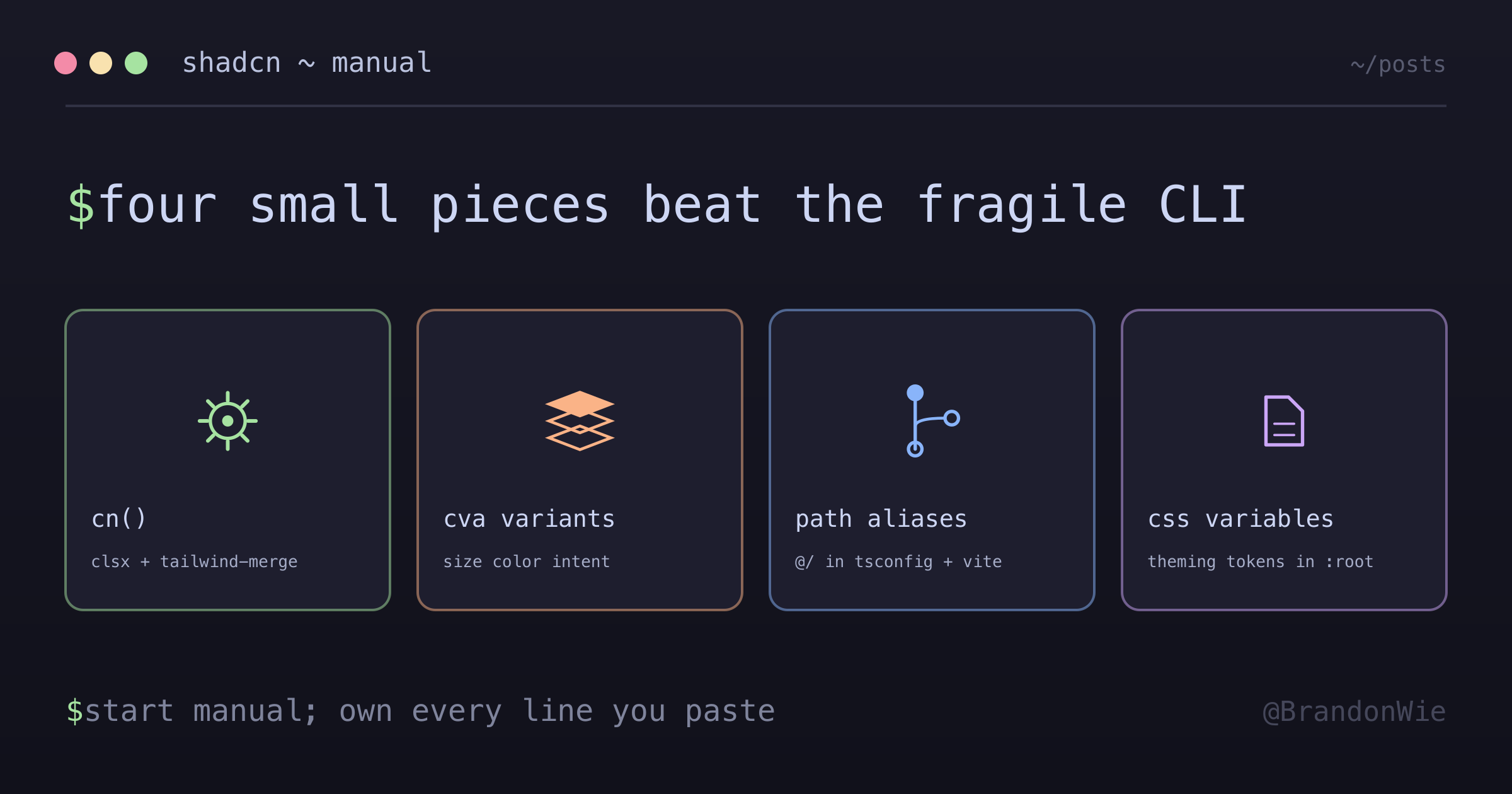
The Four Pieces You Need
The entire foundation boils down to three npm installs and one utility function.
Dependencies
npm install class-variance-authority clsx tailwind-merge
npm install @radix-ui/react-slot
npm install tailwindcss-animate
Each package has a single, clear job:
| Package | Purpose |
|---|---|
class-variance-authority | Component variant definitions (cva) |
clsx | Conditional className joining |
tailwind-merge | Deduplicates conflicting Tailwind classes |
@radix-ui/react-slot | Polymorphic asChild prop support |
tailwindcss-animate | Animation utilities for Tailwind |
You will use class-variance-authority (usually imported as cva) in every component to define variants like size, color, and intent. clsx handles conditional class toggling — think isActive && "bg-blue-500". And tailwind-merge prevents class collisions where both p-4 and p-2 end up in the same element (it picks the last one).
@radix-ui/react-slot powers the asChild pattern that shadcn components use everywhere. It lets a Button component render as an anchor tag or a Next.js Link without wrapper divs. tailwindcss-animate is a Tailwind plugin that provides animation utility classes used by dialogs, dropdowns, and other animated components.
1. Create the cn() Utility
This is the single most important piece. Every shadcn component calls cn() to merge class names. The function composes clsx (for conditional logic) with tailwind-merge (for deduplication) into one call:
// src/lib/utils.ts
import { type ClassValue, clsx } from "clsx";
import { twMerge } from "tailwind-merge";

export function cn(...inputs: ClassValue[]) {
  return twMerge(clsx(inputs));
}
With cn() in place, you can write cn("p-4 bg-red-500", isLarge && "p-8") and get the right output. Without tailwind-merge, you would get p-4 bg-red-500 p-8 and the browser would apply whichever p-* class appeared last in the stylesheet — not the one you wrote last in the string. That is a subtle bug that cn() eliminates.
2. Register the Tailwind Plugin
Add tailwindcss-animate to your Tailwind config so that animation utilities like animate-in, animate-out, fade-in, and slide-in-from-top become available:
// tailwind.config.js
plugins: [require("tailwindcss-animate")];
3. Configure Path Aliases
This step is optional but recommended. shadcn components use @/ imports by default, so setting up the alias saves you from rewriting every import path after copy-pasting:
// tsconfig.json
{
  "compilerOptions": {
    "baseUrl": ".",
    "paths": { "@/*": ["./src/*"] }
  }
}

// vite.config.ts
import path from 'path';
export default defineConfig({
  resolve: {
    alias: { '@': path.resolve(__dirname, './src') }
  }
});
The TypeScript config tells the type checker about the alias. The Vite config tells the bundler. You need both.
4. Define CSS Variables for Theming
shadcn/ui uses CSS custom properties for its color system. Define them in your global stylesheet so that utility classes like bg-background and text-foreground resolve correctly:
:root {
  --background: #1a1a1a;
  --foreground: #e5e5e5;
  --border: #404040;
  /* ... your design tokens ... */
}
Every shadcn component references these variables through Tailwind classes. When you want to change the theme, you update these values in one place.
Using Components After Setup
With all four pieces in place, building components follows a consistent pattern. Here is how a Button with variants looks:
import { cn } from "@/lib/utils";
import { cva, type VariantProps } from "class-variance-authority";

const buttonVariants = cva(
  "inline-flex items-center justify-center rounded-md text-sm",
  {
    variants: {
      variant: {
        default: "bg-primary text-primary-foreground",
        outline: "border border-border bg-transparent"
      },
      size: {
        default: "h-10 px-4 py-2",
        sm: "h-9 px-3"
      }
    },
    defaultVariants: {
      variant: "default",
      size: "default"
    }
  }
);
The cva function takes a base class string and a variants object. It returns a function you call with the current variant values to get the final class string. Paired with cn(), you can layer in conditional and override classes without worrying about conflicts.
Why Manual Over CLI
I tried both approaches across multiple projects. Here is how they compare:
| Factor | CLI (npx shadcn-ui init) | Manual |
|---|---|---|
| Control | Opinionated structure | Full control |
| Dependencies | Installs everything | Only what you need |
| Config | Generates components.json | Not needed |
| Learning | Black box | Understand each piece |
The CLI approach works fine for greenfield projects where you do not care about folder structure. But the moment you have an existing Tailwind config, custom path aliases, or a non-standard project layout, the CLI fights you. It wants things in specific places and generates configuration files you then have to maintain.
The manual approach takes about five minutes. You install three packages, write a six-line utility function, add one Tailwind plugin, and optionally set up CSS variables. After that, you copy-paste individual components from the shadcn docs and they work.
Takeaway
shadcn/ui’s manual setup is four steps: install dependencies, create cn(), register the animate plugin, and define CSS variables. The CLI hides these steps behind automation, but the automation is fragile when your project deviates from the happy path. Understanding what each piece does — clsx for conditionals, tailwind-merge for deduplication, cva for variants, react-slot for polymorphism — makes debugging component issues straightforward instead of mysterious.
Start manual. If you find yourself doing it ten times a week, then consider the CLI.